A spooky name for a spooky bit of Halloween decor, indeed. 🙂

Showing you a bit more of our Halloween decorations today. Hope you enjoy!


All in good fun… 🙂
xoxo, Maria
A spooky name for a spooky bit of Halloween decor, indeed. 🙂
Showing you a bit more of our Halloween decorations today. Hope you enjoy!
All in good fun… 🙂
xoxo, Maria
Hey, there. 🙂 It’s a rainy morning here in Arizona and I am in full-on Fall mode with my clothes — tights, a long-sleeved dress, and I am planning on putting some boots on later when I leave the house. This girl is a happy one!
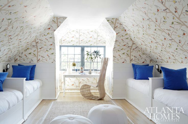
Blue and white interiors…I love them. Whether classic or contemporary, this color scheme never has and never will go out of style.

This is the perfect marriage of traditional and ultra-modern. Lindsey Adelman and her light fixtures leave me speechless.

I have loved this bedroom for a really long time — I always come back to it. The fabrics look so luxurious, I think that’s what draws me to it. Plus the French furniture.

How fun is this blue and white restaurant? The metallic Tolix stools add a nice pop that keep the space interesting and current.

I don’t know about you, but I would call this a variant of blue… blue-gray, perhaps? Again with the luscious fabrics. I love the texture of that scalloped matelasse coverlet. Plus a bubble chandelier! Exciting stuff. 🙂

Expertly done, this room. There are so many different styles and time periods mixed in here, but somehow, it works. Don’t even get me started on that wallpaper. Toile is my favorite. A black and white zebra-print rug grounds the room because of all of the colors workin’ in here. And the unexpected pop of green and yellow (chosen in the same chroma as the blue — perfect!) adds the best zing. A room like this is difficult to do, but it is really wonderful when everything works together, not against one another.
The statement of this room is obviously the wallpaper — and a beautiful statement it makes. Keeping everything else white is great when you have a perfect focal point. There should be one star to the room — everything else needs supporting roles. The perfect blue was chosen, making this room pop.

Stunning in every way. The distribution of blue, the birch wood art installation, the furniture silhouettes, and the lucite. Oh, and the color-coordinated child. Literally obsessed with this room.
What is your favorite color combination?
xoxo, Maria
Hey there, everyone — happy Monday! I hope you all had a wonderful weekend. Ours was really nice; there was a party for Greyson’s last day of work on Saturday, which was a blast, and then he and I went out on a date last night. We saw ‘Gone Girl,’ which is not for those who spook easily, but it was really good! I read the book several months ago and devoured it, so it was nice to see it turned into a crazy good adaptation. We went out for sushi afterward — our favorite date night meal. 🙂
A few weeks ago I was looking through an old Elle Decor magazine and I stumbled upon a feature of the most beautiful and serene Hamptons cottage I’ve seen in a long time. It belongs to Malcolm Carfrae, the head of communications of Calvin Klein, and I just had to share it with you today. It’s super elegant and not at all fussy — my favorite combination. Let’s take a look inside!

I’m in love with this paint color, first of all. It’s blue-y gray and so reminiscent of the sea without being a typical blue beach house color.


Really pretty neutrals in this guest room and plenty of texture. I also love the added drama with the white lamps and black lampshades.

How cute is this kitchen? I love the mix of old and new, sleek and country-chic.

Texture everywhere — the only way to properly do neutrals like this. Lots to appreciate in this room.

Monochromatic and completely relaxed. I love the little zest of purple with the flowers — just enough to throw your eye around the space in a really interesting way.

This is the pool house — and there is a little bit of a different vibe in here. Slightly rustic-contemporary-and-industrial. A bit of all of those elements becomes pleasingly eclectic and really comfortable and fun.
What do you think of this house? Do you have a favorite room?
All images can be found here.
xoxo, Maria
Last week I was at Pottery Barn Kids picking up a baby shower gift for a friend of mine, and I was completely struck by the amazing things that Pottery Barn Teen carries! Obviously the products at the Kids variety are adorable, too (the kitchen accessories are basically to-die-for), but there was a certain collection at PB Teen that I fell in love with. I grabbed a handful of the various catalogs as I walked out the door, and when I got home, I scoured the pages for the items I had seen.
The Emily & Meritt Collection was my answer, and the teenager inside of me couldn’t get enough of these glitzy furnishings that make for a super chic statement without being too grown up. Emily and Meritt are fashion stylists and designers with a very apparent love for edgy and funky pieces with a little bit of rock and roll flair. I’ll show you some of my favorite items from the collection. 🙂

Really cute scalloped duvet set in classic black and white.

I love the metallic stripes and dots on this duvet set.

Of course, some leopard print is a must for any growing girl with style. 🙂 A little bit of glitz keeps the print age-appropriate.

Some rivet designs — edging things up a little bit with some floral prints in the background. Love it!

And you know that a teen girl needs some sequins in her life. It’s basically a necessity.

More gold — Pottery Barn calls this a Liquid Gold Throw. I love it!

Adding a splash of Parisian elegance to the mix.

A really great gold bookcase — this is one of those Pottery Barn Teen items that I wouldn’t hesitate to use for an adult client (as long as the height was acceptable). I would love a pair of these bookcases in an office!

An adorable ticking stripe chaise. I really don’t think that anything else needs to be said about it.

LOVE this pinboard. Another item that could be used in an adult’s space. Again, love this for an office or closet to pin fashion inspiration, etc.

These are lovely and add a really pretty throwback vintage element to a room. Don’t they look like “grandmother’s”?

Whimsical and super sweet alarm clocks. A reference to Alice in Wonderland?

And finally, perhaps my favorite item in the entire collection — this metallic hide rug. DYING, I love it so much.
Definitely check out the collection, and if you have a Pottery Barn Teen or Kids near you, I highly advise you to pop in because those stores are pretty magical and sincerely make me long for my childhood all over again. 🙂
xoxo, Maria
PS: This is not a sponsored post — I just fell in love with these things and I knew that you would, too!
We’re almost to the end of the week, people! Time to get excited and do the It’s-Almost-Friday Dance. 😉
A look that I love in almost any interior, any style, is a piece of statement artwork that pops from the wall and does all of the talking. Like I’ve said before, me personally, I am really in love with neutral spaces; but my job by nature makes me appreciate all kinds of design. A splash of personality in any interior is usually what makes it go from cookie-cutter-magazine-clipping to hey-someone-actually-lives-here. Let’s look at some pretty pictures, shall we? 🙂

Here we have two colorful chinoiserie cabinets that are grounded by a statement piece — the black abstract art. Black is great to use when you’re introducing bright colors to a space. Tones it down!

How fun is this piece? The room without it would be way too mute and dull. But with the addition of this dotted canvas, it’s fun, lively, and contemporary.

While I don’t find this interior to be incredibly inviting, just look at the amazing contrast here. The artwork makes it. The color palette chosen for the piece really sets the mood for the space. Just think of how different the room would look with something brighter.

Check out that ceiling! This definitely counts as artwork. Speaking of which… I need to go to this cafe pronto.

What some would consider a cold interior is warmed up in this entryway with a piece featuring reds, oranges, and bits of blue and purple. It absolutely draws you forward into the space. I would like to see more color in the other artwork, though! Perhaps there is more at some other angles that we can’t see here?

We’ve got statement wallpaper and statement artwork going on in this dining room, but it works! The wallpaper is busy and neutral while the art is colorful and simple. A great way to mix — it looks effortless and chic.

Statement artwork doesn’t always have to be colorful, sometimes it can just make you laugh. This piece works well with the monotonous color scheme, yet provides a bit of humor to the space. This is a piece of art that will be talked about — thus, making a statement.
What kind of statement artwork do you like best? Colorful? Wordy? Black and white?
xoxo, Maria
Hey there, happy Wednesday! This week is flying by. I posted a couple of weeks ago Part One of my Pairing High and Low series. This is an easy topic and a fun one to master — pairing high and low furnishing to make everything appear to be luxurious and high-end. Today we’re going to look at my in-laws’ kitchen. As you know, most all of these posts (as well as any other home-related posts) will be of my in-laws’ house because we are living here. But their house doesn’t disappoint, so here we go!
So. The kitchen.

For this post, I’m really concentrating on the items displayed atop the cabinets.

A few pieces are from a trip that they took to Italy, and then the rest is filled in with finds from HomeGoods. And there you have it!
A Few High-End Pieces + Several Lower-End Pieces = An Overall High-End Look — for everything above those cabinets. Everything looks substantial and expensive.

What do you think? Can you tell the difference?
xoxo, Maria
Hey there! It’s already Wednesday and I feel like this week is just flying by. As a sort of continuation of my June post about those super-gorgeous Lindsey Adelman light fixtures, today I’m writing about the also-super-gorgeous bubble light fixtures that I am seeing so much of lately! You know, these?

I love these fixtures. And yes, I am sort of biased because we are going to be installing one in a client’s loft pretty soon, and I just think they’re stunning… But there’s something so whimsical and delicate about them without it being a frilly or fussy addition to a room.


Clearly gorgeous over a dining table. Have I made my point yet?

Clearly the answer is no.

Really pretty metallic bubbles in this bathroom. A masculine and feminine juxtaposition all at once.

Equally lovely in this chic little kitchen! I love how simple this space is, but it is certainly not lacking in sophistication.

How about this awesome egg yolk-yellow variation? To me, this screams, “Put me in an entryway with a high ceiling!” Would. Be. Killer.

And, here it is, in all its glory…installed. And it does not disappoint.

There’s also this fun variation — Sputnik light meets bubble light. I think it gives the look a little more edge, don’t you?

Lastly, I’ll leave you with my favorite variation of the bubble light fixture… If I were to put one in my home, this is the look that suits me. Super delicate, not too contemporary, and pairs really well with more traditional decor. Love it!
How about you? Do you LOVE the bubble light fixture as much as I do?
xoxo, Maria
Hey there, friends. Happy Wednesday!
I was doing some work on Pinterest this morning, and I saw quite a few laundry rooms that were really pretty. Someday I will have a laundry room of my own that actually makes me want to do laundry. 🙂 There’s so much you can do to customize the space for what you use it for, too. I’ve seen some with gift wrapping stations, some with computers, some with reading chairs — I love it! Make the space work for what you use it for; that is the best way to design, anyway. Let’s look at some pretty pictures!

via Homedit
This laundry room also doubles as a pantry, or at least a place where an overflow of kitchen essentials are stored. A very clever idea! I love the farmhouse vibe that is mixed with more contemporary finishes.

via HomeBunch
The dark cabinetry in this room is so pretty. I love the globe light fixture and the storage bins underneath the appliances. And aren’t those little metal buckets on the top shelf cute? I wonder what’s in those…

via designMARVEL
This laundry room proves that your space doesn’t have to be large to be lovely. First of all, the lighting is perfect. Industrial, while still working beautifully in this rustic design scheme. The little faucet is adorable, too.

via Decor Pad
So, me personally, I’m not a huge fan of the stacked washer/dryer situation. It feels a little bit inconvenient to me, but I know that some people love it. I do like the way that it looks. And I like and appreciate the area for hanging up clothes. I find that an area like that is pretty essential for me when I do laundry.

via HomeTalk
This laundry room is so well put together in both a design and aesthetic sense. The finishes all marry so well. The beadboard is such a sweet, cottage-y touch. It’s a relatively easy solution to make a room look more custom, too. My sister-in-law added beadboard in her builder-grade kitchen and painted her cabinets, and both made such a difference. It’s the little things…the details in design that matter.

via Houzz
I have loved this particular laundry room for a long time. It’s perfect for a beach house, with a door leading, perhaps, to the beach where people with sandy feet and wet bathing suits will be entering…right into the laundry room. Pretty brilliant! The soft color of the walls, the lighting, the crisp white mixed with a buttery cream — gorgeously executed.

via Lacquered Life
Now this is an interesting solution — a laundry station in the kitchen! I really love this idea! A great way to multi-task and having the laundry area in a more central location is a good idea for a lot of people. And the machines are behind cabinets, so with the doors closed, it just looks like a little nook area. Very awesome idea.

via Flickr
What better place for bright whites than a laundry room? With all of the accessories, this room goes from sterile to warm and lived-in. Personally, I think the one thing I would change is to take out the cabinet above the sink and extend the hanging rod all the way up to the top of the inset. It may be difficult to hang anything substantial with the way that area is currently designed.

via HomeTalk
Omg. Dream room right here. A herringbone brick floor? Double the washer/dryer action? Beautiful cabinets with an even more beautiful finish? Adorable French sink? Please please please. I love this room so much, and I am daring to call it my favorite laundry room I have ever seen. What do you think?

via House & Home
A cute wallpaper on an accent wall in the laundry room — now that’s a great idea, and an easy one to implement in any laundry room, whether custom or builder-grade.
Are you re-designing your laundry room in your head yet?
xoxo, Maria
While I am usually a fan of more traditional kitchens for my own space, I still very much appreciate all different styles of design. For me, a crisp and classic kitchen is what I dream of, but how cool are those with a bit more contrast in the finishes? Let’s take a look at some inspirational spaces.

via Houzz
I like how this is still a pretty transitional design, but the black and white contrast is really sleek and sexy. The way the counter space finishes flip-flop with the island finishes is a good design practice altogether. It keeps things subtly interesting without going over-the-top.

via Luella & June
I think this kitchen concept is pretty much genius. The marble backsplash softens this look, and the mirrored gold element is harsh, however toned down with the other features. Really beautiful.
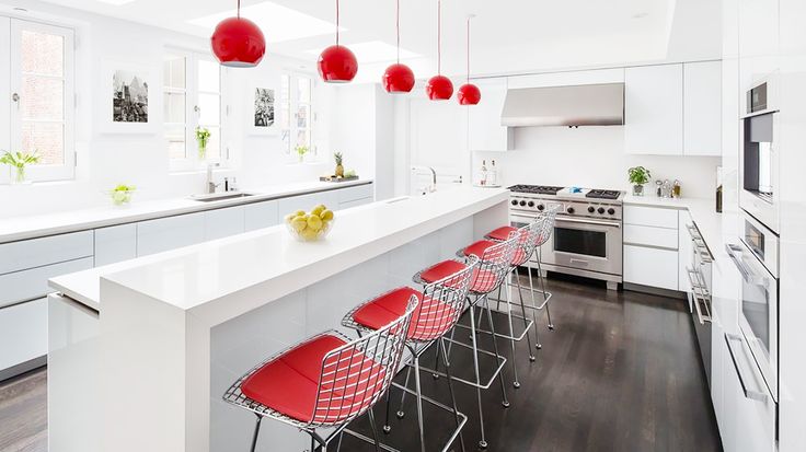
via Domaine Home
The designer of this kitchen made a statement with the overhead pendants and the seat cushions on those Bertoia barstools. This minimalist look is gorgeously done and doesn’t look too stark or unfriendly. It has such a fun feel to it.

via Home Adore
I know this is a red feature again, but I just want to mention something with this space. The red provides contrast with the white, yes, but I imagine that this entire space is one giant room with different seating areas, possibly an entry, etc. The red wall is a way to draw you in to the space — warmer colors placed on far walls in a space pull you forward, providing more contrast, energy, and life. This is something really important to remember when you are painting your home. I will do a separate post about this at some point — very crucial.

via Domaine Home
Another white and gold contrast, this one much more classic (with a farmhouse twist) than the previous. This gold-accented island is really more aged brass-looking and less shiny than the upper cabinets in the other photo. It lends itself to this space more than a super glossy and stark gold would have.

via Home Adore
White, green, and red — a classic contemporary color combination. I’m loving those cabinets on the right-hand wall with that frosty glass. Very cool.

via Dwell
Pops of vibrant yellow add an element of liveliness and fun to this kitchen. And the color selection isn’t random — the wall to the left with the paneling? You can find a toned-down version of the sunny yellow right there. A great example of how colors don’t necessarily have to match perfectly. Graying-out a variation is a great way to pair two colors that are the same.

via Home Adore
Steel-y grays and reds — a perfect industrial combination. In this kitchen, horizontal lines are its main component. Start at the top of the photo and draw your eye downward… See it? This creates a very uniform, clean look. However, adding in some items with vertical thrust just might make this space a touch more interesting.

via HGTV
Now this is adorably bold, but I don’t think I would ever advise a client to do this unless they were a lifelong fan of yellow. I see hard surfaces in a kitchen as investments, and the subway tiles would be costly to replace once all of the labor and materials were figured into it. However, this is a pretty traditional kitchen that strays more to the transitional/soft-contemporary side because of the backsplash, pendants, and barstools. I really do love it, but it would have to be the perfect set of circumstances for me to bring this idea to a client.

Stark white and espresso brown. It’s elegant and warm, and with these modern finishes, reads very clean and pretty masculine. The waterfall countertop is one of my favorite elements of a lot of contemporary kitchens out there. A very sleek and sophisticated feature.
What is your favorite color juxtaposition when it comes to kitchen design? Do you like these bold elements that create a lot of contrast?
xoxo, Maria
